
Introduction
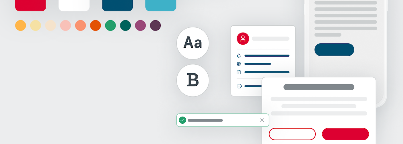
The Chick-fil-A Design System is a comprehensive repository of reusable elements, components, and design patterns, governed by well-defined standards. The Design System serves to empower product teams to efficiently craft a uniform and cohesive user experience across a range of digital products.
Key Benefits
Section titled “Key Benefits”The shared vision of the design system is to create a unified digital experience for Operators and their Team Members by providing shared design patterns with consistent branding to teams across the business. The design patterns offer a visual style consistent with Chick-fil-A’s Brand Identity Standards that meets the high standards of usability and accessibility.
As a part of our focus on the Total User Experience of Operators and Team members, we’re striving to provide a more cohesive experience with technology in the restaurant.
Efficiency
Section titled “Efficiency”The design systems contains reusable UI components that help teams build complex, durable, and accessible user interfaces across projects. Both the design patterns and developed components can be re-used or used as a basis for the needs of other applications— saving re-work and improving velocity.
Consistency
Section titled “Consistency”Having a central repository of designed components provides consistent user patterns and look and feel for Operators and Team Members. The design system will serve as a “source of truth” for Chick-fil-A’s common digital components.
Shared Language
Section titled “Shared Language”The design system helps developers, designers, and stakeholders all communicate more clearly, among themselves and between each other. They can share in the documentation around design decisions, proper usage, and behaviors of components. The design system can serve as a bridge between disciplines.
React Core
Section titled “React Core”What is React Core?
Section titled “What is React Core?”@cfa/react-core is a new, powerful UI component library, built on top of Adobe Spectrum’s React Aria component library. The initial release includes ~25 modern and flexible components. These components can be used alongside existing @cfa/react-components, so engineering teams can begin using them without needing to refactor existing react component code or fix breaking change in their codebases.
React Core is built with:
- Accessible foundations offering fully WCAG compliant components
- Modern compatibility with evolving frontend development trends, such as Server-Side Rendering (SSR) and React Server Components
- Flexibility and control to fit every developer team’s UI needs
Check out the React Core Slide Deck for a deeper dive into React Core.
Who is it for?
Section titled “Who is it for?”All UI developers are encouraged to begin using React Core. Not only does React Core remediate many limitations adopters have identified in @cfa/react-components, the library offers top-tier flexibility and framework compatibility for CFA application development teams.
Can I Use it Now?
Section titled “Can I Use it Now?”Yes! A simple way to get started is to use React Core for new UI feature development, or in migrating a @cfa/react-components feature to @cfa/react-core implementation. The Design System team will continue to release new components and enhancements so be sure to monitor the #designsystem Slack channel for releases.
Visit React Core Components overview page.
We Need Your Help!
Section titled “We Need Your Help!”We encourage users to share feedback with us, as it will help us to prioritize enhancements and get them in adopter hands sooner. All ongoing discussions, releases, and future work can be found in the CFA Design System GitHub Project.
Support and Feedback
Section titled “Support and Feedback”For support and to submit feedback, there are several avenues to do so which can be found here.